Overview and Objective
In this lesson, students will create a variety of charts for a given data set and make observations about which type of chart is best for certain types of data. Some of the data sets provided in this lesson are best represented by only a few chart types, while other data sets will be well-represented by a variety of chart types. Students will have to select the one chart that they believe best-represents a data set and will explain their choices. In this lesson, students will be using the Charts and Statistics tools in Polypad. Click here for a tutorial on these tools.
Warm-Up
This lesson uses data from the Tokyo 2020 Summer Olympics. These games were rescheduled to the summer of 2021. Begin the lesson by asking students to share some memories they have of these Olympic games. Students can share in small groups and then report out to the whole class or you can facilitate a whole class discussion. The goal of the warm-up is to activate any prior knowledge about the Olympic games.
Main Activity
Chart Creation
Share this Polypad with students. Click here to learn how to share Polypads with students and how to view their work.
For each data set, invite students to do the following:
- Create the chart they believe best represents the data.
- Create the chart they believe worst represents the data.
- Write a few sentences explaining their choices (this can be done within the Polypad or not).
- While looking at the best chart for each data set, write a few sentences about what the chart causes them to notice and wonder about the data represented.
Students can do this activity individually or in small groups. After creating a best and worst chart for each data type and answering the questions for each, invite students to come up with their own Olympic related data to research, enter into a table, and represent on a chart. Olympics.com is a good site to find data sets.
Class Sharing and Discussion
Share students' work with the class and facilitate a discussion about the chart types used. You may want to emphasize some of the following:
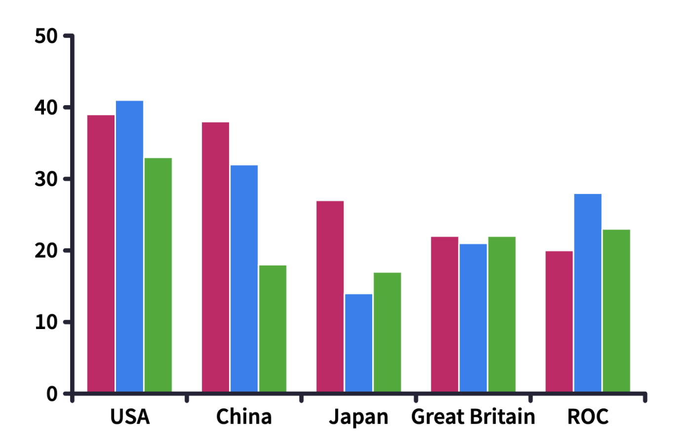
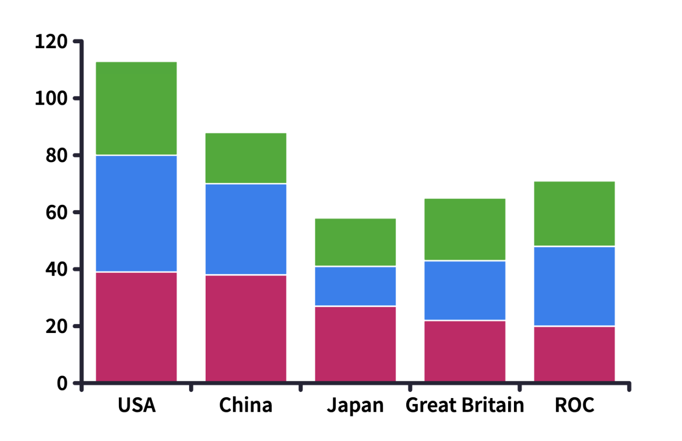
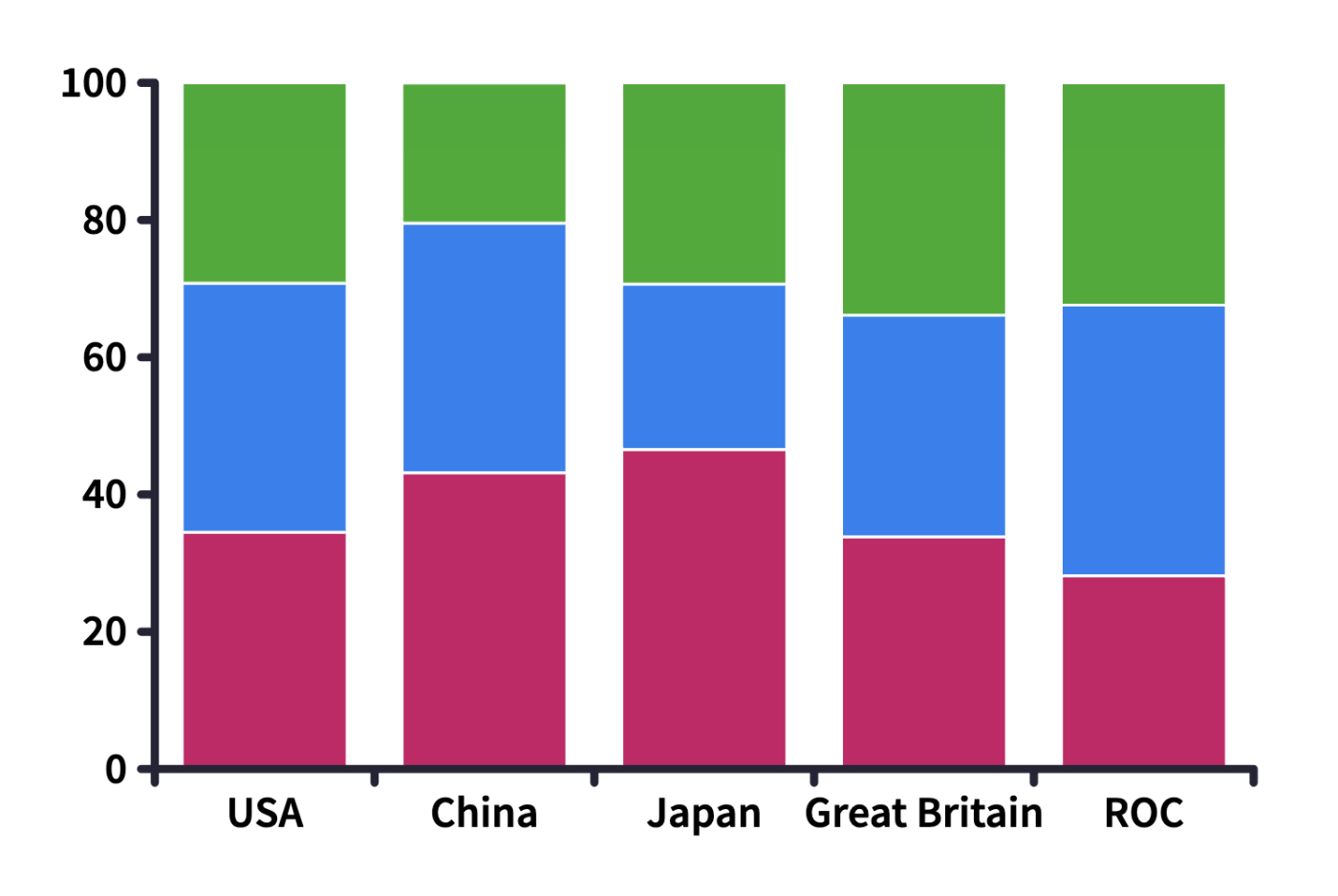
- The medal count data is best represented with a column or row chart. When presenting the column chart, be sure to show examples of Grouped, Stacked and Percentage and discuss the advantages and disadvantages of each type. Be sure to discuss why the other chart types are not effective ways to represent this data.


- The 400-meter hurdles world record data is best represented by a line chart as it shows the change in time and offers a clear comparison between the men's and women's world records. Students can click the link in the Polypad to learn more about the records. They can use the data to make predictions about when the next world record in this event will be set.
- The continent data can be represented with a variety of charts, but it is the only data that can be appropriately represented with the pie chart or donut chart.
Be sure to spend some time having students share some "noticing and wondering" for each data set. Meaningful conversation can be had from each data set.
- Based on medal counts, how could we determine which country "won" the Olympics?
- What do you notice about the difference between the world records over time?
- What continent has not hosted the Olympics?
Closure
To conclude the lesson, ask students to respond to the following prompts:
- What type of data is best represented a bar chart?
- What type of data is best represented a line chart?
- What type of data is best represented a pie chart?